
Internship Platform
AI-assisted internship management platform for a Singapore government agency
Role: Client-facing UX Lead (NTT DATA)
Client: A Singapore government agency
Timeline: January to July 2026. Pitch from January to March, then delivery from the March kickoff
Team: 1 UX architect, 2 UX consultants (including me), 2 Business Analysts, 1 Project Manager, 1 Project Director and 2 developers
Status: Not built. The project ended at the prototype and test-planning stage
Summary
A government agency was replacing the system that runs its internship programmes, for students from secondary school to university.
As the client-facing UX lead, I owned the UX strategy and usability test plan, shaped the experience across seven user roles, designed how AI would support staff decisions without replacing them, and redesigned the full lifecycle in a working prototype when the design system changed mid-project.
7 user roles across two experiences · 8 lifecycle stages, from set-up to offboarding · 200+ edge-case scenarios tested against the design
Context
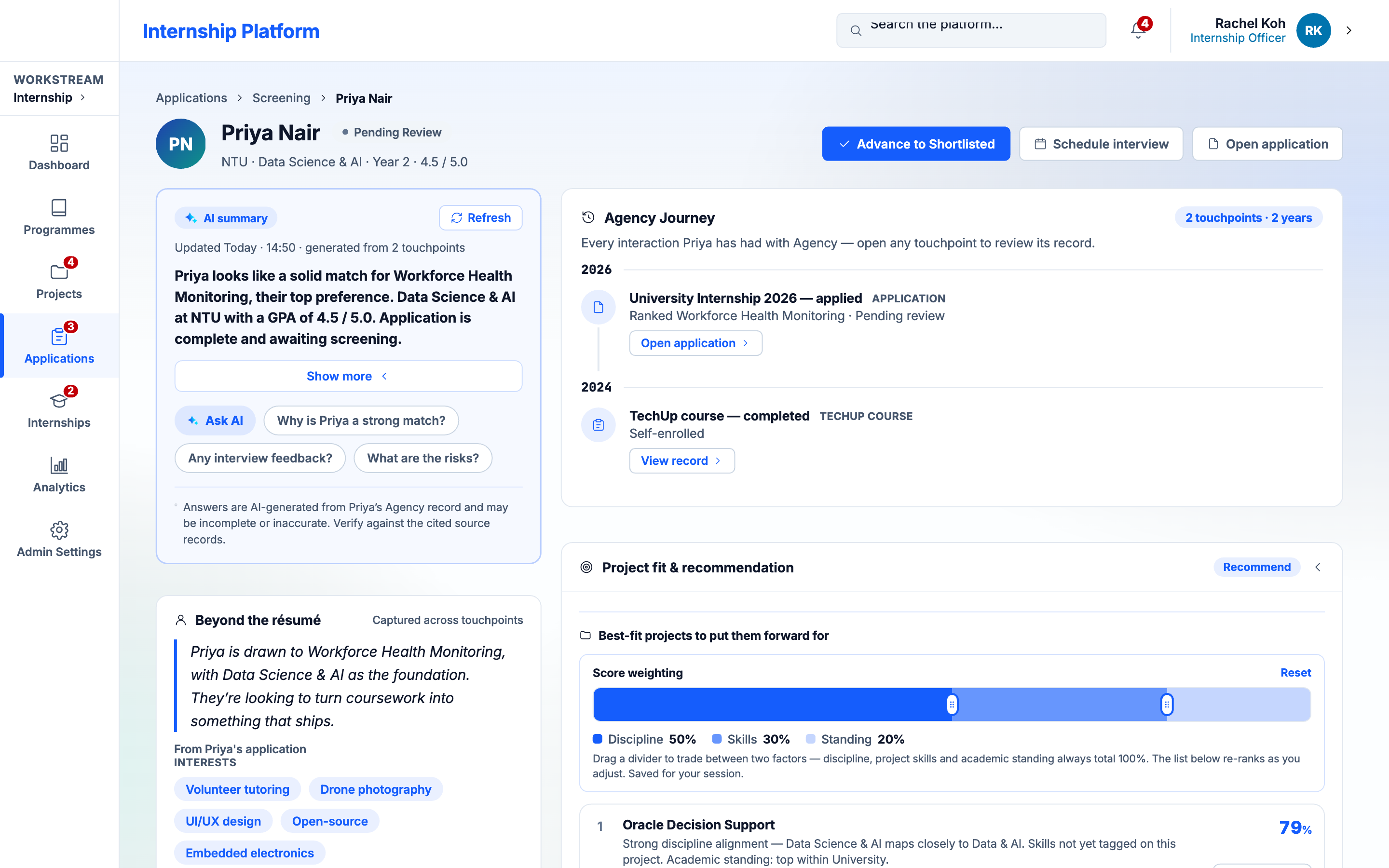
The platform covers the whole internship lifecycle: programme and project set-up, outreach, application, AI screening, interviews, offers, onboarding and offboarding. Students apply through an external portal, while six staff roles, from internship officers and mentors to directors and administrators, work in an internal console. Each role owned one stage, and no one saw the whole flow.
The redesign also introduced AI into screening, candidate–project matching and project write-up review, under government data-protection standards.
I joined at the pitch, where I produced the video that walked the client through the proposed experience end to end.
The Challenge
Four constraints shaped the work.
- Fixed scope, moving requirements. The contract was fixed-scope and waterfall, yet no workflow was ever signed off. Three months of intensive stakeholder workshops, three hours at a time and two to three times a week, kept reopening the flows, and the service blueprints were eventually set aside.
- Inherited research with a blind spot. Service blueprints and personas came from a previous vendor. They were thorough about staff, but students, a key user group, weren't covered at all.
- A design system migration mid-project. The agency moved to a new version of its design system, so every screen had to be rebuilt.
- Five months, seven roles. Delivery ran from the March kickoff to July, across the full lifecycle.
Key Decisions
1. Fill the gap in the research before designing for it.
With no coverage of students, I created student proto-personas to design for in the meantime. I framed them as hypotheses to validate in usability testing, not as findings.
2. Start the dashboard from the job, not the data.
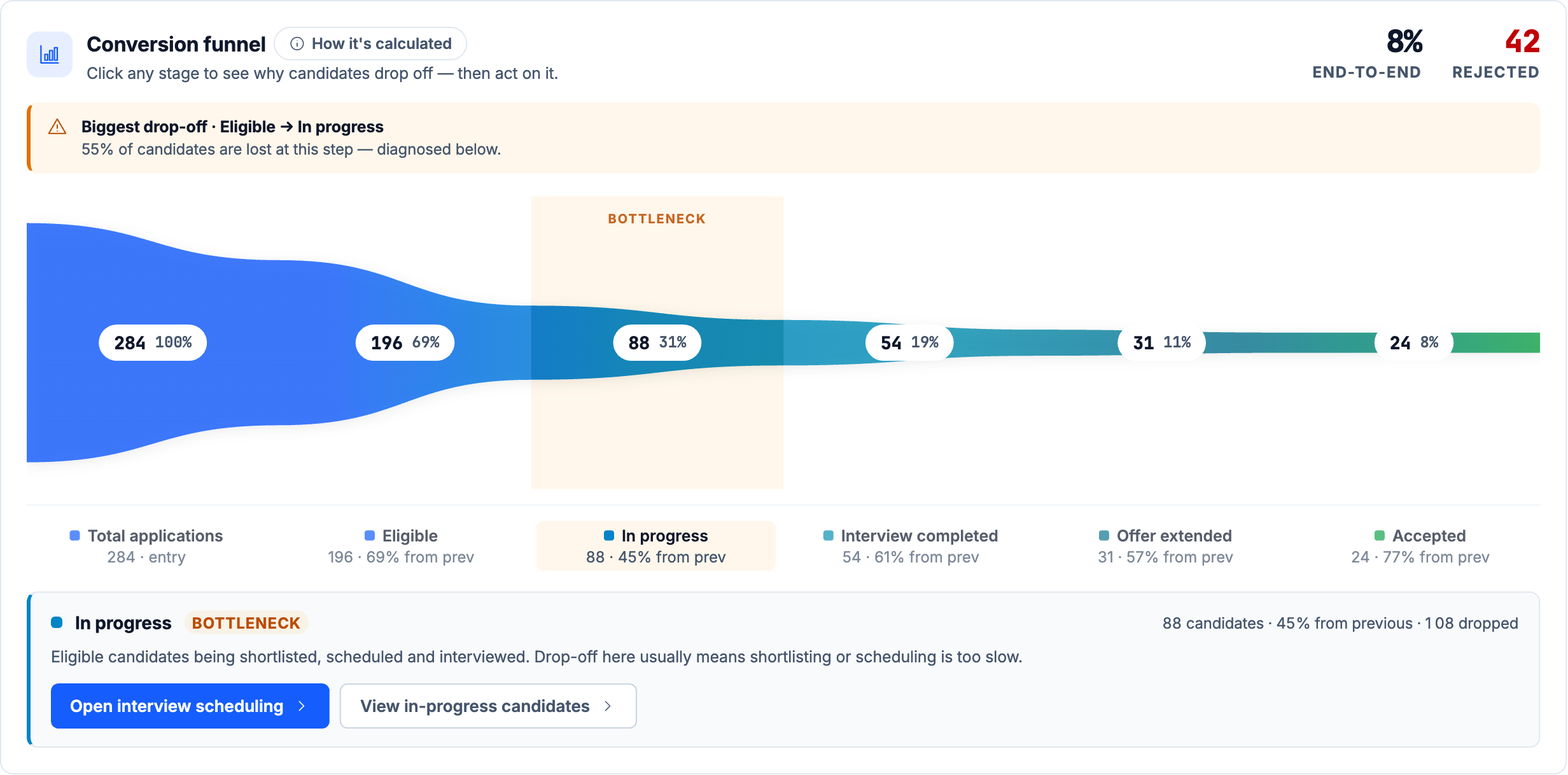
In the workshop on how internship officers process applications, I asked what job their home screen needed to do, rather than which data it should show. We agreed that for every internship track, officers needed to see quickly where applicants were dropping off, diagnose why, and fix it.
That became a funnel at the top of the officer's home screen, with every anomaly highlighted and a call to action leading straight to the page where they could act on it. Colours came from the agency's brand guide, and subtle micro-interactions answered repeated stakeholder requests for something that felt more like a consumer app than an old-school dashboard.
3. AI that advises, never decides.
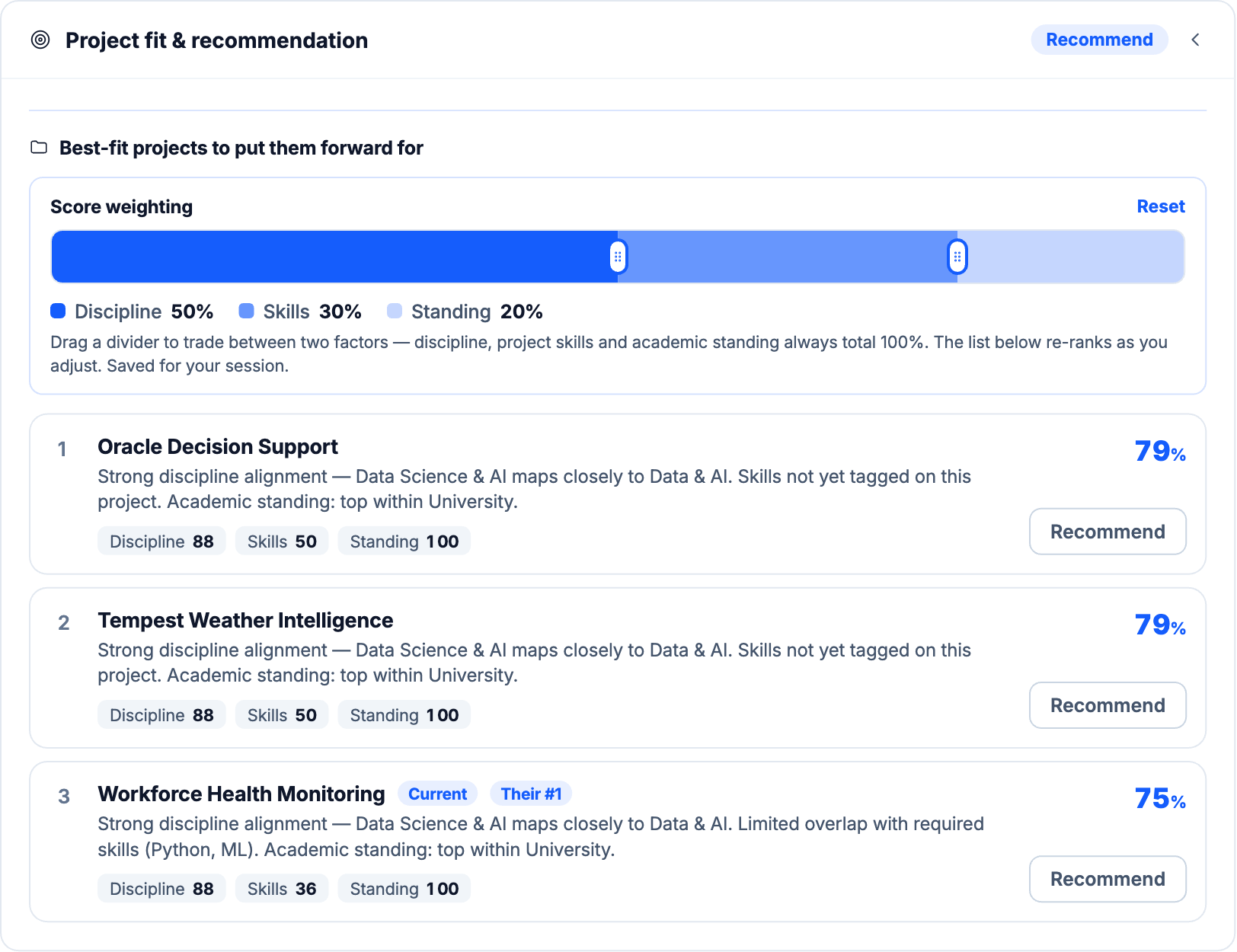
I held every AI feature to established AI design principles, above all transparency and the ability to recover from mistakes. Every AI surface shows its sources, a plain-language rationale and a note that a person is accountable for the decision. People can regenerate a summary or flag an unhelpful answer, and officers can drag to rebalance how match scores are weighted across discipline, skills and academic standing (50/30/20 by default). If the AI fails, the case falls back to human review, never an automatic rejection.
4. Make statuses and rules readable to everyone.
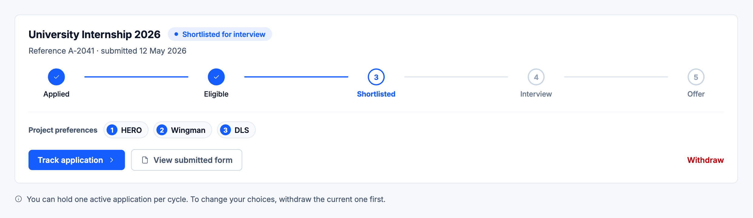
"Incomplete" isn't "Ineligible", and a no-show isn't a rejection, so each status has its own next action. Students see plain-language labels, and a five-step tracker shows where they stand.
The student application had complex branching logic and could run long, so I designed it to show one question at a time, inspired by Typeform, to keep both manageable for students.
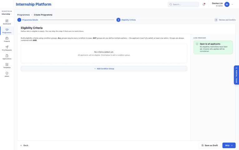
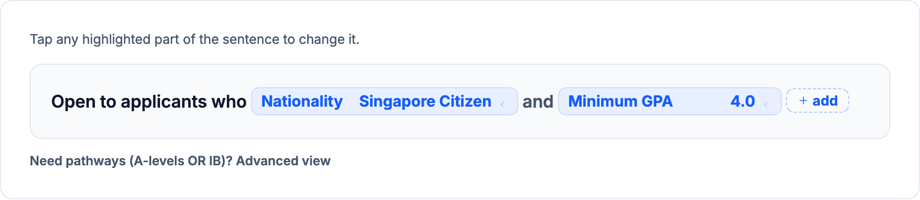
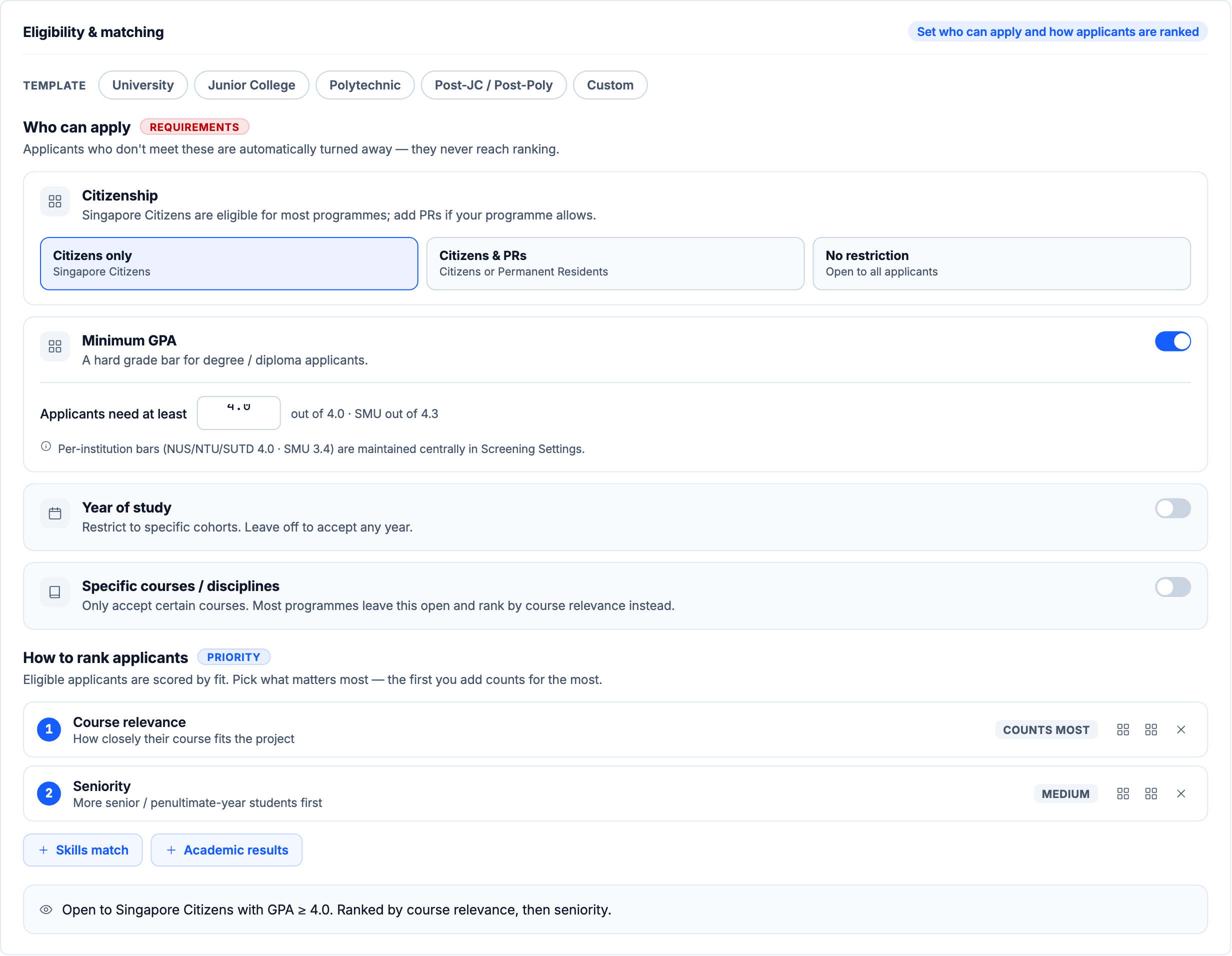
Eligibility rules took three rounds. An earlier rule builder, built on AND/OR conditions, proved too complex for officers when we walked through it in a workshop. My first redesign was a fill-in-the-blank sentence builder, inspired by monday.com, where officers tap any part of the sentence to change it. It read well, but it didn't survive the exception cases in my stress test. So I moved to guided cards: pick the intern type, confirm a few plain-English requirements, put ranking priorities in order, then check a one-line summary of who can apply. This version was never validated with the client or tested with officers, so it remains a hypothesis.
5. Redesign with AI when the design system changed.
Redrawing every screen by hand in Figma wasn't realistic in the time left. Starting from the team's existing coded prototype, I used Claude to redesign the full lifecycle in about two weeks, as a working, high-fidelity prototype on the new design system, held to its tokens and accessibility rules. I also connected Claude to Mobbin to see how other products handle similar problems, for further inspiration as I worked.
6. Stress-test the design while requirements kept moving.
Workflow workshops kept reopening flows instead of confirming them, and feedback arrived through many channels, sometimes contradicting itself. I set up a design feedback log and pushed for the team to use it: about 150 items over the workshops, each tagged by type (strategic, flow or UI) and impact. Anything that changed flows or scope went into the log, and quick UI fixes stayed as Figma comments, so the team worked from one list of decisions instead of scattered messages.
Instead of waiting for sign-off, I wrote a catalogue of more than 200 edge-case scenarios with Claude, from lapsed offers and delayed security clearance to prompt injection through student free text and two officers editing the same record. I then used Claude to check each scenario against the coded prototype, and the biggest gaps went into the next round of design.
A few examples from the catalogue:
- A student fails the interview for their first-choice project. The officer can route them to their next preference or a recommended project, and the first slot is released.
- Eligibility rules change after applications arrive. The system warns about the impact and asks for confirmation before re-evaluating anyone.
- A transcript hides instructions aimed at the AI. The summary ignores them and summarises the content safely.
- A strong applicant misses the mandatory grade bar. They're marked ineligible, and only an approved manual-review path can override it.
Where It Landed
The project ended before build.
By the time I left in July, I had delivered:
- The UX strategy for the platform
- A full-lifecycle prototype across seven roles, on the new design system
- Student proto-personas filling the gap in the inherited research
- A stress-test catalogue of 200+ scenarios
- A design feedback log that triaged about 150 workshop items by type and impact
- A usability test plan for students and staff, which I wrote, ready to run after stakeholder validation
The planned next steps were stakeholder validation, then usability testing with students and staff, then iteration before development.
Learnings
Anchor the design in jobs, not flows. The flows changed again and again over three months of workshops, but the jobs people needed done stayed the same. Designing around those jobs, like the officers' funnel, gave the work a core that didn't move with every reopened flow.
A process needs an owner. The feedback log only worked while someone enforced it, and that someone ended up being me. On my next project, I'd agree who owns feedback governance before the first workshop, not after the feedback starts piling up.
Check whose voice inherited research carries. The research I inherited was thorough about staff and silent about students. Auditing it for missing users is now one of the first things I do.
AI changes what one designer can hold. With Claude, I redesigned a full-lifecycle prototype through a design system migration, then wrote and ran a 200-scenario stress test against it. The skill that mattered was writing precise constraints: tokens, accessibility rules and domain logic.